El Club de Creativos nos encargó diseñar el trofeo de los Premios Nacionales de Creatividad. El premio más importante de la industria de la creatividad publicitaria en España. Es un objeto que no solo lo van a ver y valorar los creativos que más admiras, sino que les guste o no va a estar en sus vitrinas, lo van a tener en sus manos… lo van a codiciar.
Es un diseño que tiene que estar a la altura de su valor, sin ser pretencioso. Un diseño que tiene que ser reconocible, pero no evidente ni literal. Buscamos diseñar un objeto que contenga en si el significado de la experiencia que representa ganar un Premio Nacional de Creatividad, que tenga un poder simbólico capaz de hacerle perdurar en el tiempo.


Durante el proceso creativo trabajamos con diferentes ideas que fluctuaban en la tensión entre lo continuista y lo rupturista, entre la literalidad del logo en tres dimensiones y lo rupturista de una forma totalmente abstracta, entre el carácter divertido de unas letras sueltas y la solemnidad de una escultura. En esta tensión se fue afinando la idea que en un principio descartamos por obvia. Una C.
Una “C” es una “O” incompleta, pero tipográficamente es mucho más interesante. Se puede jugar con la apertura, la uña o el grosor de su panza. Su imperfección, lo que le falta, abre múltiples posibilidades a la creatividad que la perfección de una “O” no tiene. Sin embargo, tiene también parte de la fuerza del círculo: un diámetro constante, la manera más sencilla de dibujar una forma perfecta.

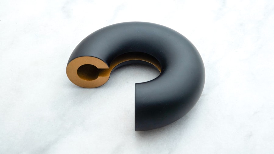
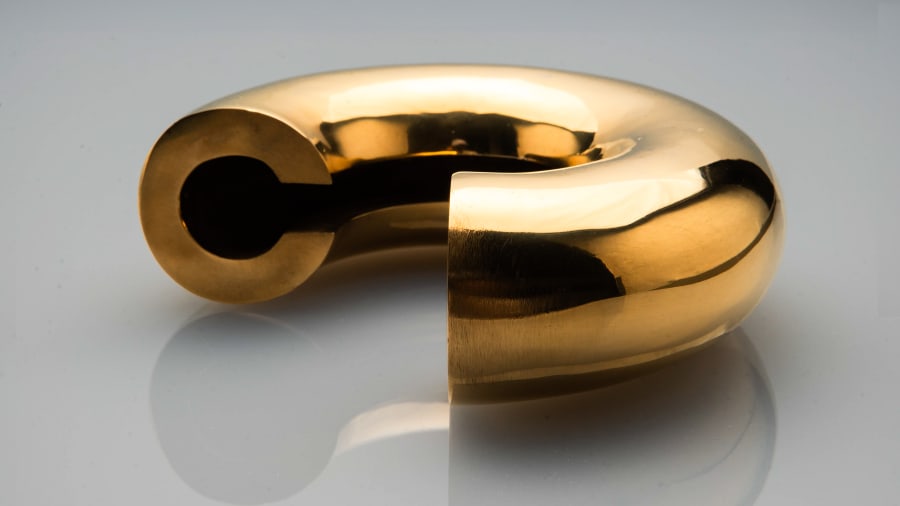
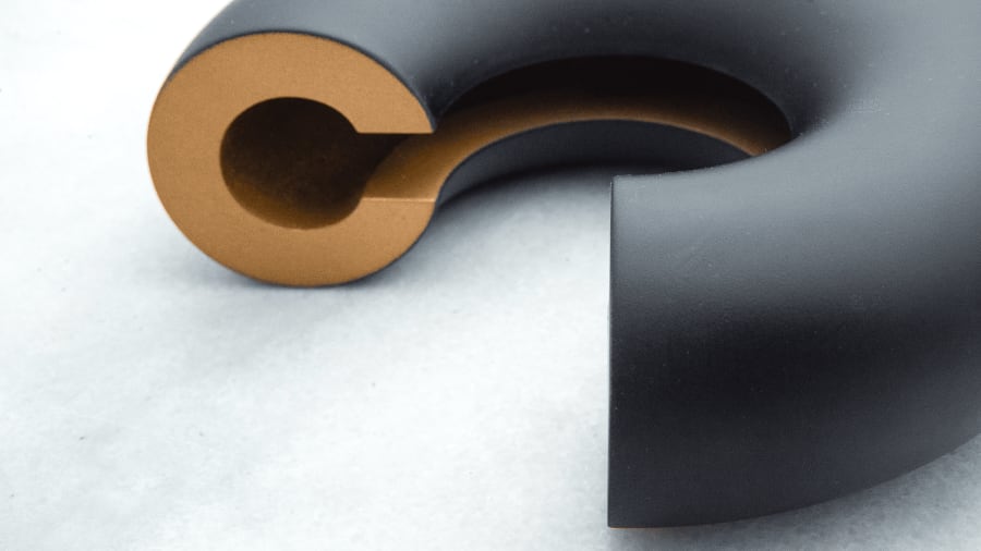
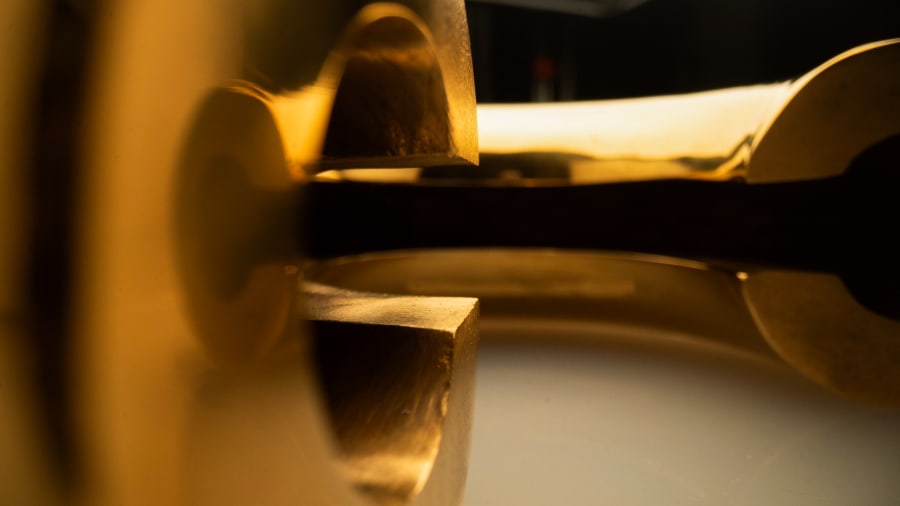
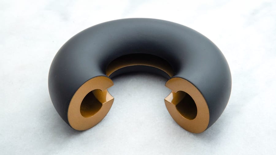
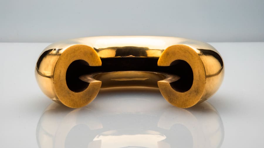
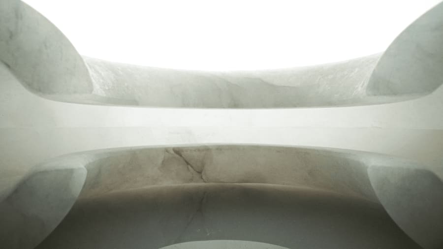
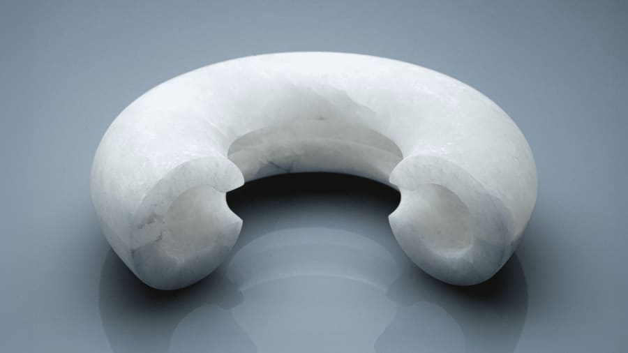
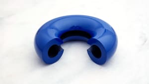
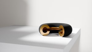
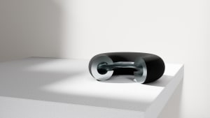
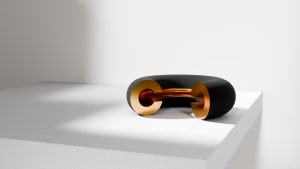
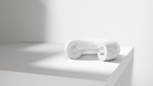
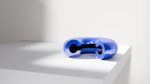
El diseño que proponemos es simple: la forma de una “C” bidimensional, que revolucionada 270º sobre un radio de giro exterior de 16 cm, crea una “C” tridimensional. Vista de frente son dos “C” enfrentadas. En cualquier otra perspectiva es una “C” tridimensional perfecta, con una sección cilíndrica regular y un desarrollo regular con un diámetro constante. Es como un bucle, tiene cierta auto referencialidad, cierta literalidad, cierta continuidad.
A la vez es una forma icónica muy reconocible: una “C”. Un toroide incompleto, como en nuestro trabajo, donde lo perfecto no es lo ideal, donde hace falta quitar una parte del círculo para crear magia.


---
The Club de Creativos commissioned us to design the trophy for the National Creativity Awards, the most prestigious award in the advertising creativity industry in Spain. It's an object that not only will be seen and valued by the creatives you admire most, but whether they like it or not, it will be on their shelves, they will hold it in their hands… they will covet it.
It’s a design that has to match its value without being pretentious. A design that has to be recognizable but not obvious or literal. We aim to design an object that embodies the experience of winning a National Creativity Award, with symbolic power that ensures its lasting impact over time.
During the creative process, we worked with different ideas that fluctuated between continuity and disruption, between the literalness of the logo in three dimensions and the disruptiveness of a completely abstract form, between the playful character of loose letters and the solemnity of a sculpture. In this tension, we refined the idea that we initially discarded for being too obvious. A “C”.
A "C" is an incomplete "O," but typographically it is much more interesting. You can play with the opening, the hook, or the thickness of its curve. Its imperfection, what it lacks, opens up multiple possibilities for creativity that the perfection of an "O" does not have. However, it also retains part of the strength of the circle: a constant diameter, the simplest way to draw a perfect shape.
The design we propose is simple: the shape of a two-dimensional "C," rotated 270º around an external radius of 16 cm, creating a three-dimensional "C." Viewed from the front, it shows two facing "C"s. From any other perspective, it is a perfect three-dimensional "C," with a regular cylindrical section and a consistent development with a constant diameter. It is like a loop, having a certain self-referentiality, a certain literalness, a certain continuity.
At the same time, it is a highly recognizable iconic form: a "C." An incomplete toroid, much like our work, where perfection is not ideal, where a part of the circle needs to be removed to create magic.
Client: Club de Creativos / https://www.clubdecreativos.com/
April - 2024